
Vasthutech Civil Engineering Consultancy started on January 1st, 2005 at NVA Building in Neduvachalil Paramba Karanthur. The office was inaugurated by Neduvachalil Karanavar N. Shankaran. In 2009, the office was shifted to Neduvachalil Building near Markaz Puthoor Kadavu Road and was inaugurated by my father, Neduvachalil Karanavar P. Velayudhan.
Immerse yourself in the authentic casino atmosphere with live dealers at Fortune Tiger slots apk, ensuring a trustworthy gaming experience from the comfort of your home.
Discover thrilling games and exclusive bonuses at non gamstop casinos, where players can enjoy a wide range of slots, live dealers, and exciting online gambling experiences.
Discover thrilling gaming experiences with non gamstop casinos offering a wide array of slots, live dealer games, and enticing bonuses, elevating your online gambling journey.

Navigating the permit process can be complex. We assist you in obtaining the necessary building permits from local authorities in Kerala, ensuring all documentation and regulatory requirements are met for a smooth and compliant construction process..
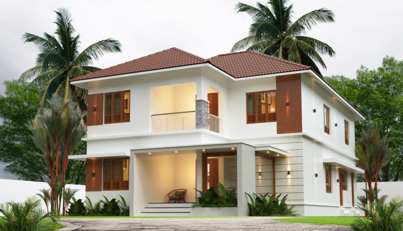
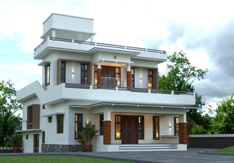
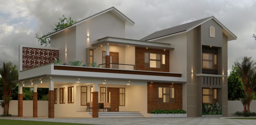
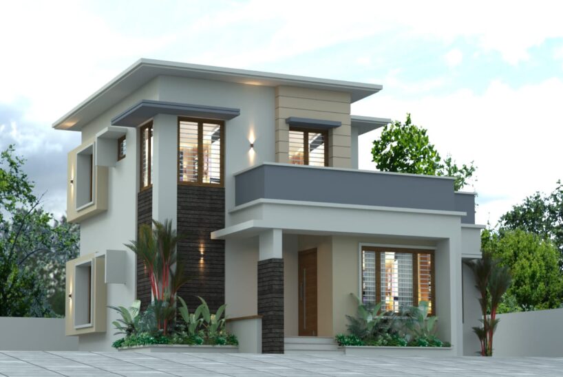
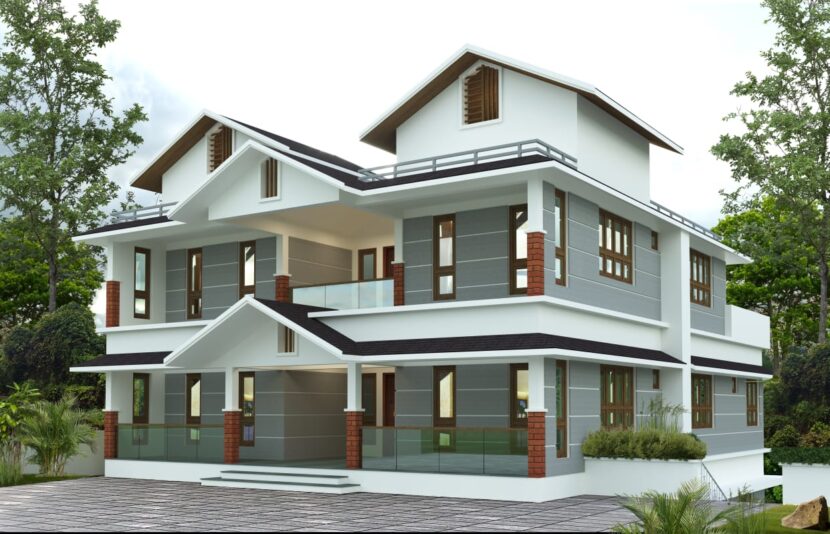
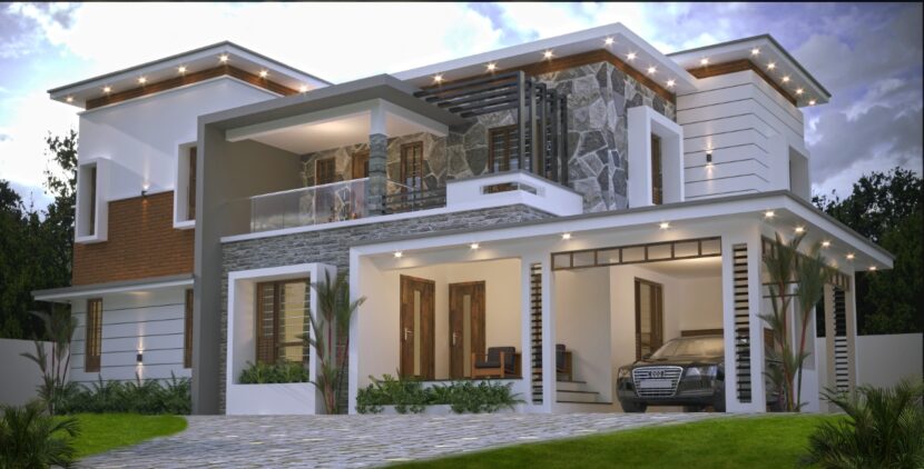
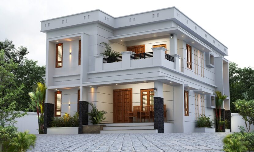
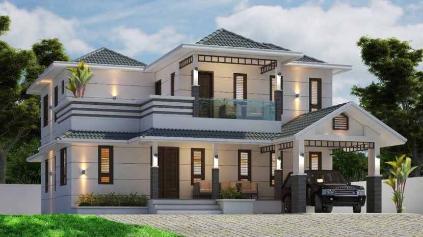
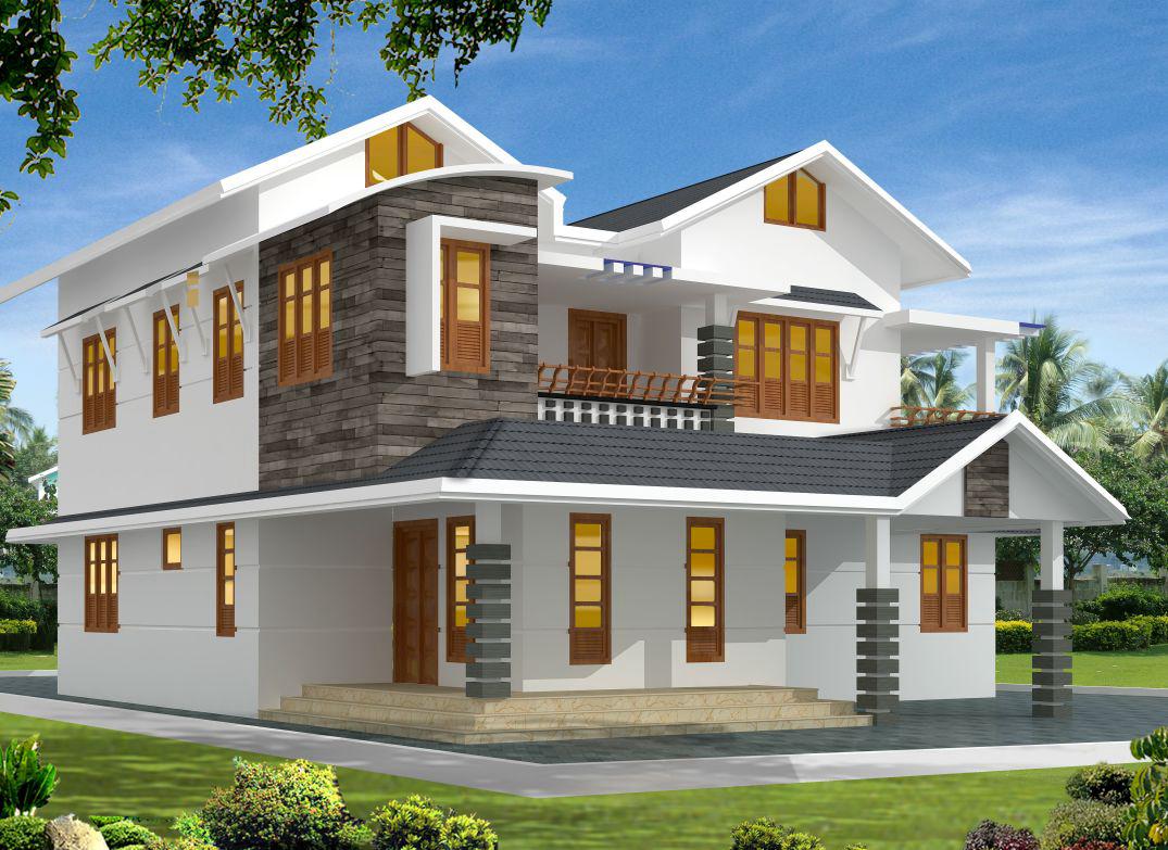
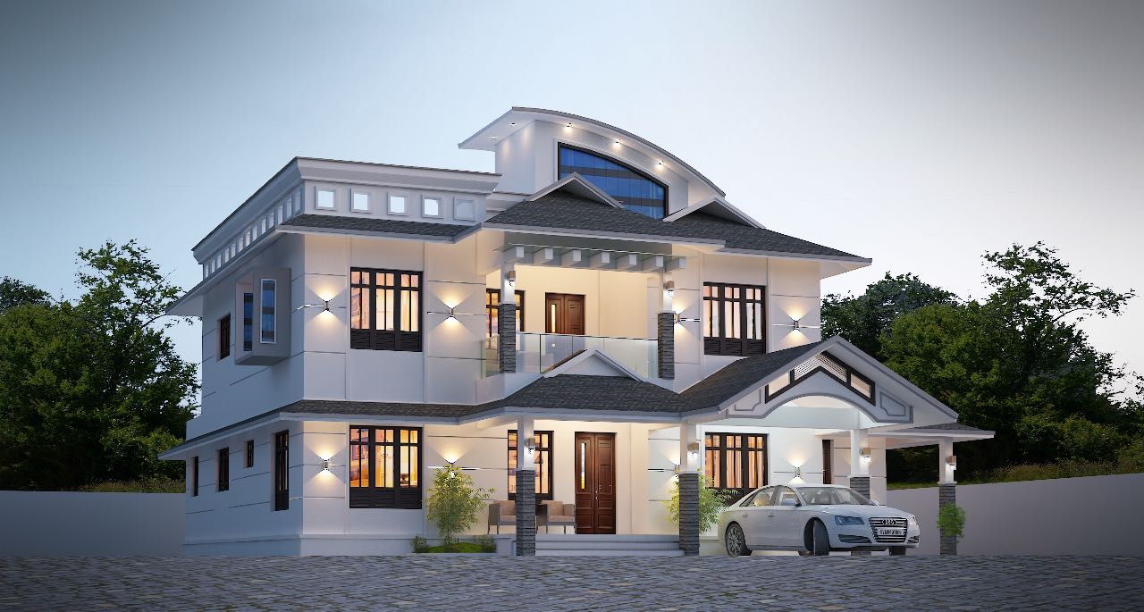
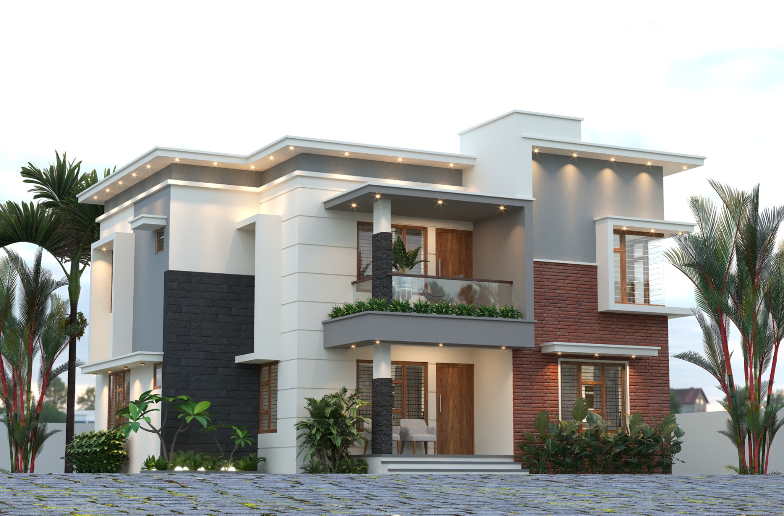
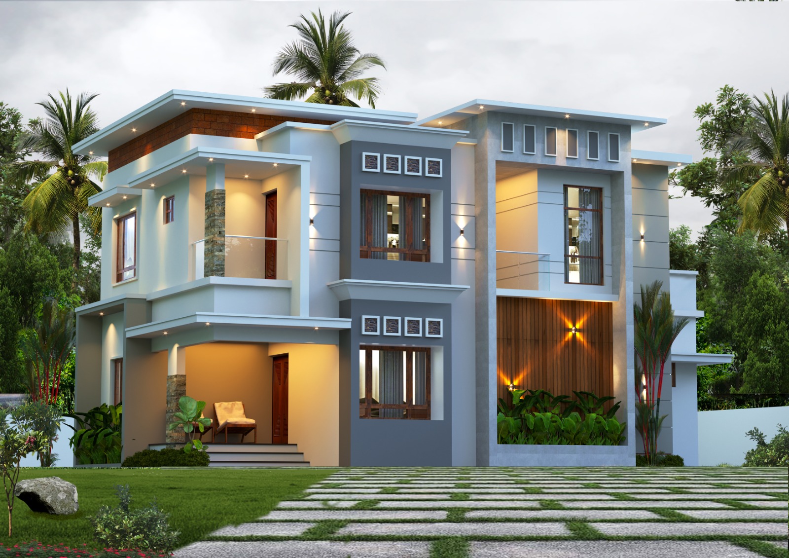
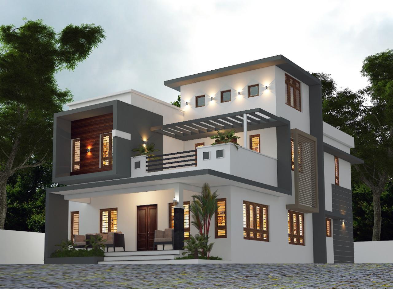
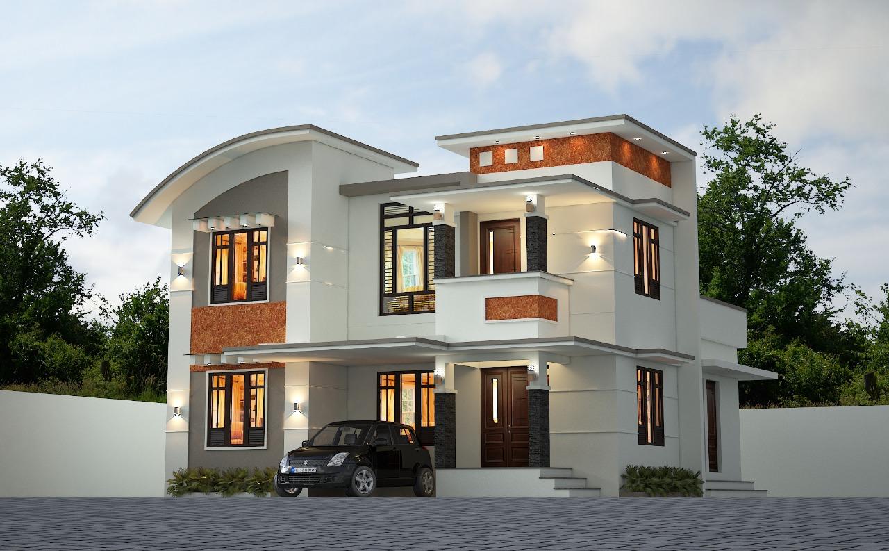
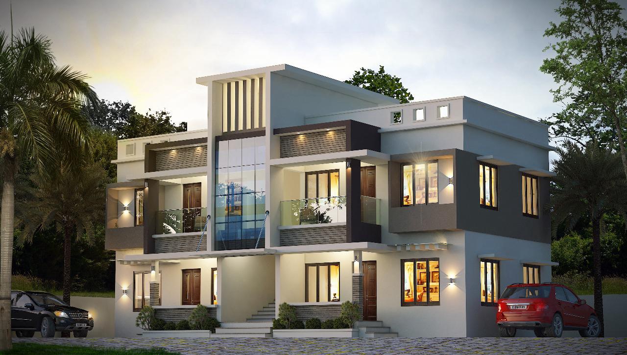
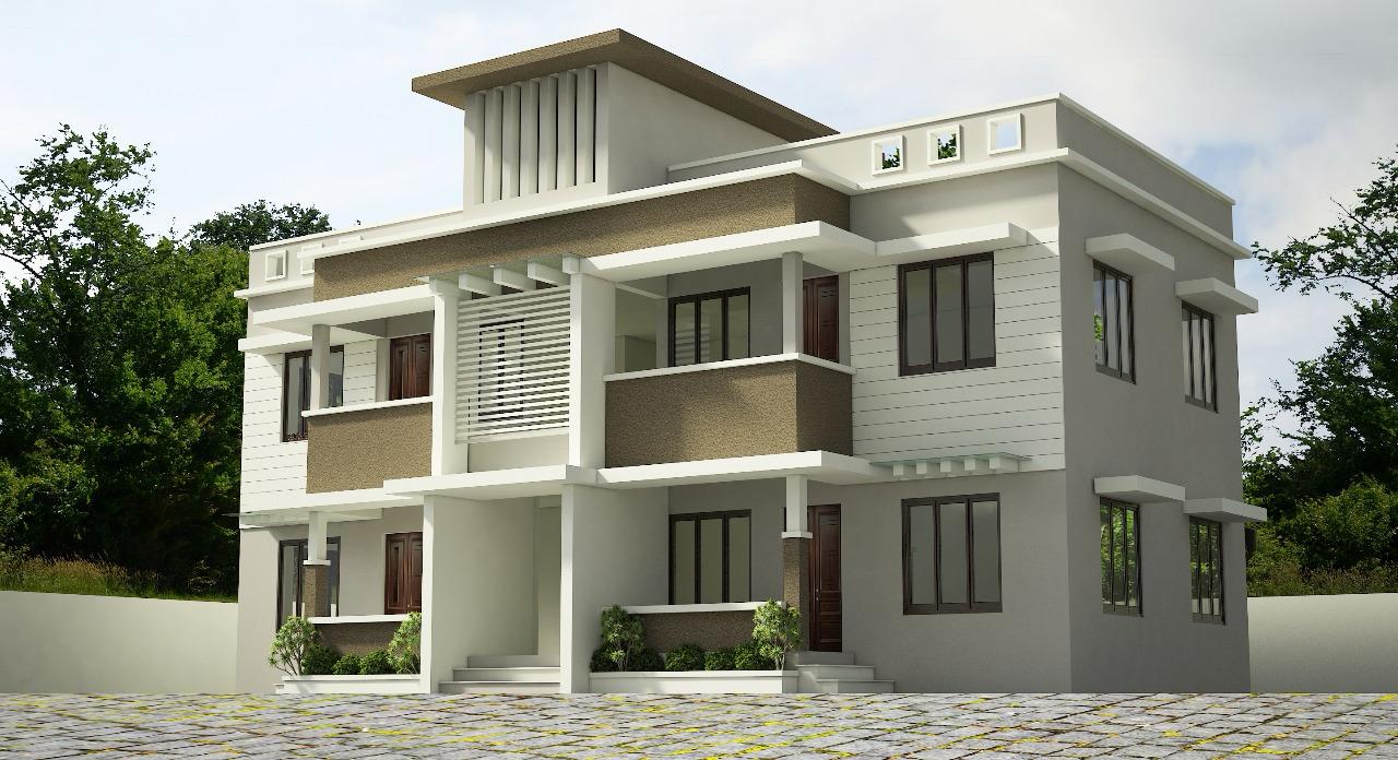
We specialize in structural design, offering detailed engineering solutions and drawings that ensure the stability and integrity of your building. Our designs account for Kerala’s specific geological and climatic conditions, such as heavy rainfall and seismic activity, to guarantee durability and safety..
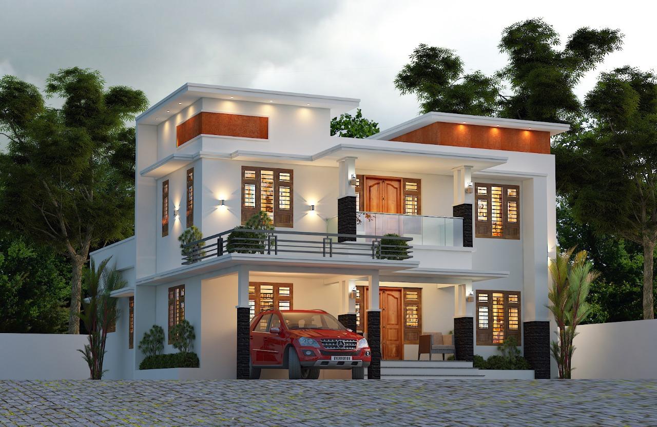
We offer precise estimation services and prepare detailed Bills of Quantities to help you understand the cost implications of your project. Our BOQs include a breakdown of materials, labor, and other expenses, facilitating accurate budgeting and financial planning for your construction projects in Kerala.
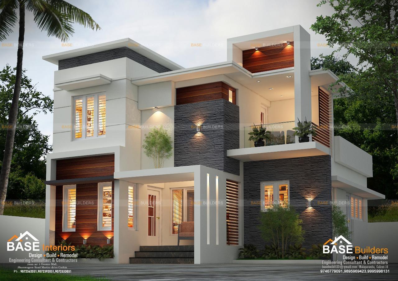
Whether you are renovating an existing structure or planning an extension, we provide technical consulting services to guide you through the process. Our expertise ensures that renovations and extensions are seamlessly integrated with the existing structure while adhering to Kerala's building regulations.
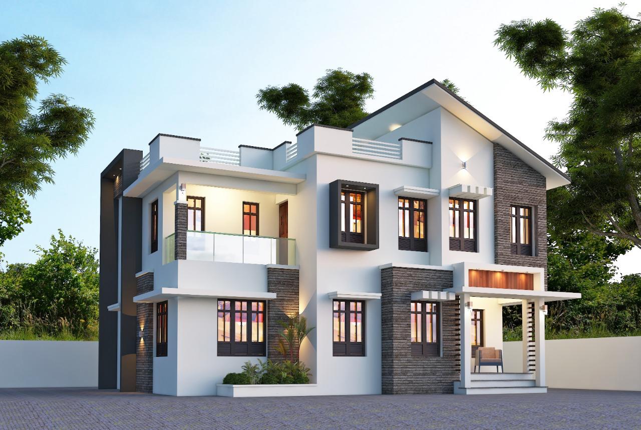
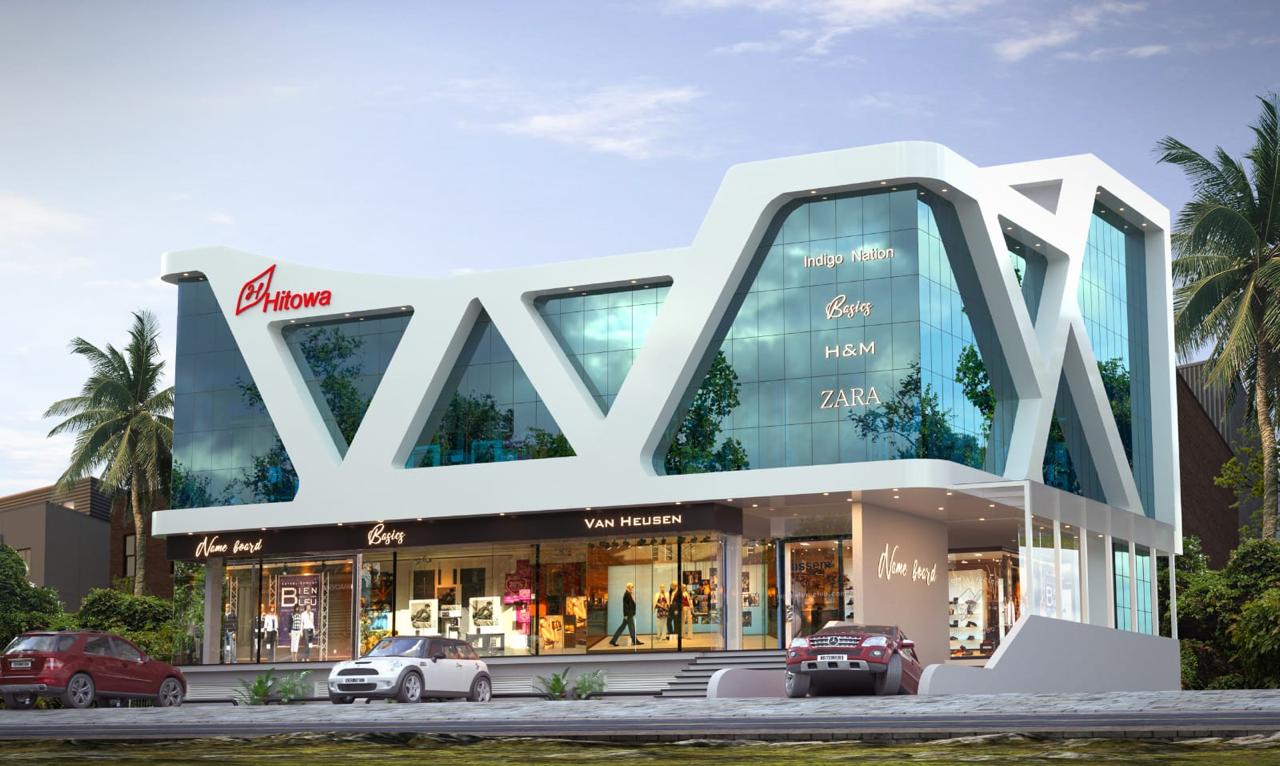
Our design and build services offer tailored solutions for your construction needs. From initial design concepts to detailed execution plans, we ensure every detail aligns with your vision and meets Kerala’s regulatory standards.
Unlock thrilling gaming experiences with generous bonuses and a wide selection of games at a non gamstop casino, where excitement and endless possibilities await every player.
Looking to elevate your gaming experience with thrilling slots and live dealers, a non gamstop casino offers a diverse range of options and bonuses tailored for every enthusiast.
Desfrute da emoção dos slots com prêmios imensos, onde fortune tiger bet transforma cada rodada em uma caça ao tesouro, oferecendo a chance de ganhar jackpots incríveis!
Enjoy seamless mobile gaming on your smartphone and tablet with starburst slots, offering a reliable and secure experience for both newcomers and seasoned casino enthusiasts.
Spin your way to thrilling jackpots with the hottest slots online, where a quick Crazy Time login unlocks a world of excitement and fortune under the best live dealer action.
Descubre la emoción del casino online con generosos bonos de bienvenida, cashback y promociones continuas mientras juegas en pin up, tu plataforma segura y confiable.
Ощутите адреналин, вращая барабаны на пинко казино, где каждый спин может стать вашим билетом к огромным выплатам и захватывающим джекпотам! Explore more rewards.
Dzięki szerokiej gamie gier, w tym automatów i stołów z krupierami na żywo, kasyno online holandia zapewnia dostęp do najnowszych tytułów od czołowych dostawców na rynku.
Experience a wide-ranging selection of casino games and top-tier providers when you log in to Betjee app in Pakistan, where secure betting meets exceptional entertainment.
Discover more at Pridružite se spletne igralnice in izkoristite bogate dobrodošlice bonuse, redni cashback ter številne promocije, ki so zasnovane za povečanje vašega igralskega p.
Discover a world of enticing welcome bonuses, thrilling cashback offers, and diverse ongoing promotions at megarich.co, where every visit enhances your online gambling experience.
Eng yirik o'yin tanlovlari va provayderlarining xilma-xilligi bilan, pin up kazino sizga o'zingizni qiziqtirgan barcha onlayn qimor o'yinlarini bir joyda topish imkonini beradi.
Tezkor ro'yxatdan o'tish imkoniyati va shoshilinch depozit qabul qilish tizimi bilan pin up uz platformasida xavfsiz va ishonchli o'yin tajribasidan bahramand bo'ling.
Oplev spændingen ved at spille på de nyeste slots, hvor "casino uden rofus" giver dig chancen for at vinde enorme jackpots med fantastiske bonusser og live dealer spil.
Upplev en säker och pålitlig spelupplevelse när du spelar dina favoritspel på NV Casino direkt från din smartphone eller surfplatta, oavsett om det handlar om slots eller live dea.
S široko izbiro iger, od igralnih avtomatov do iger z živimi delivci, nine casino slovenija ponuja vrhunsko izkušnjo, ki jo omogočajo priznanih ponudniki programske opreme.
Experience seamless mobile gaming on your smartphone or tablet with richard casino login, accessing a vast selection of slots, live dealer games, and enticing bonuses anytime, any.
Descubre una experiencia de juego segura y variada en pinup bet, donde podrás disfrutar de una amplia selección de juegos de casino de los mejores proveedores en línea.


